Icon - Arrow LeftAn icon we use to indicate a rightwards action. Icon - Arrow RightAn icon we use to indicate a leftwards action. Icon - External LinkAn icon we use to indicate a button link is external. Icon - MessageThe icon we use to represent an email action. Icon - Down ChevronUsed to indicate a dropdown. Icon - CloseUsed to indicate a close action. Icon - Dropdown ArrowUsed to indicate a dropdown. Icon - Location PinUsed to showcase a location on a map. Icon - Zoom OutUsed to indicate a zoom out action on a map. Icon - Zoom InUsed to indicate a zoom in action on a map. Icon - SearchUsed to indicate a search action. Icon - EmailUsed to indicate an emai action. Icon - FacebookFacebooks brand mark for use in social sharing icons. flipboard Icon - InstagramInstagrams brand mark for use in social sharing icons. Icon - PinterestPinterests brand mark for use in social sharing icons. Icon - TwitterTwitters brand mark for use in social sharing icons. Icon - Check MarkA check mark for checkbox buttons.
You are reading

Kitchen of the Week: An East Village Cook Space That Defies “One-Word Summaries”

Search

Kitchen of the Week: An East Village Cook Space That Defies “One-Word Summaries”

Nicole Franzen November 17, 2022

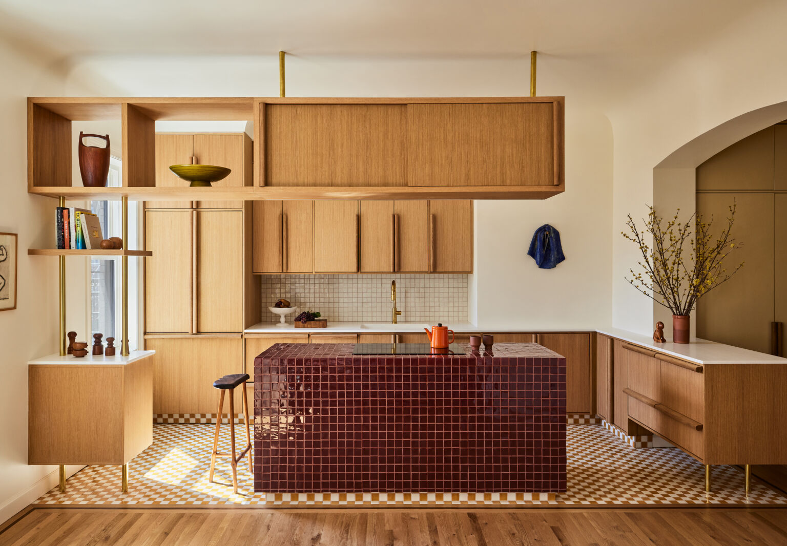
In 1902, when the East Village apartment building Onyx Court was constructed, kitchens weren’t viewed as the hearts of the home. So a compact cook space was tucked into the back corner of each unit, far from the social areas and the natural light. But in the 120 years since the six-story structure’s inception, the kitchen has become an epicenter of domestic life—which is what GRT Architects had in mind when they gut-renovated one of the apartments.

The New York City-based firm wanted to reimagine the floor plan of the 1,100-square-foot abode for contemporary living while maintaining its turn-of-the-century spirit. That meant relocating the kitchen to the opposite end, by an east-facing window, but keeping it partially separated from the dining and living spaces. A totally open layout would’ve felt too modern.

When it came to the aesthetics, GRT sought to transcend eras and trends. “It was a very natural exploration of what materials look interesting together, which surfaces should disappear, which should be really pronounced,” says co-founding partner Rustam Mehta. “I still don’t have a one-word summary for what the look of this kitchen is. And I love that. It’s got its own thing happening.”

With warm white oak cabinetry—some of which is suspended from the ceiling—and three varieties of geometric tiles, the inviting, playful kitchen combines elements of mid-century modern design with twists on Art Deco details and hints of Scandinavian minimalism, resulting in a timeless vibe all its own.

inspired by the intricate mosaics in the building&#8\2\17;s historic lobby, 14
Above: Inspired by the intricate mosaics in the building’s historic lobby, Rustam and his team went all in on tile. The floors feature an ivory and burnt orange checkerboard pattern, while the backsplash is an off-white grid. And small, red wine-hued squares are paired with a tonal dusty rose grout for a show-stopping island.
oversized, dowel like pulls add a sense of whimsy to the white oak cupboards. & 15
Above: Oversized, dowel-like pulls add a sense of whimsy to the white oak cupboards. “We originally just had these on the fridge, and we loved them so much that we thought that the mega scale would really add something to all the cabinets,” shares Rustam.
&#8\2\20;i love that we ended up with the counter being the most minimal, w 16
Above: “I love that we ended up with the counter being the most minimal, when so many kitchens make that the statement,” Rustam considers. “The very plain Corian melts into the wall. It’s also super practical. The sink is one piece welded on Corian, so there are no seams, no mess. I like it when things all line up, the functional with the aesthetic, supporting facts of the colors.”
elevated on brass poles, the peninsula feels like a piece of furniture. it sits 17
Above: Elevated on brass poles, the peninsula feels like a piece of furniture. It sits beneath an archway that Rustam and his team crafted within a thick, load-bearing wall, a nod to the original architecture.
the retro floating storage unit lets sunshine through as it subtly divides the  18
Above: The retro floating storage unit lets sunshine through as it subtly divides the kitchen from the dining zone, where a linear brass pendant hangs above an oval-shaped table. “There’s definitely a practical aspect of it, providing light to the stove and offering storage, but it was also to try to have a bit of separation without really building a wall or a soffit,” says Rustam.
conversation can flow freely from the kitchen and dining area to the living roo 19
Above: Conversation can flow freely from the kitchen and dining area to the living room and attached office—when the door is open, of course.
&#8\2\20;that is just a sheet of tempered cast textured glass, which is a m 20
Above: “That is just a sheet of tempered cast textured glass, which is a material we really love,” Rustam says of the office door. “Pairing it again with that big wood pull and letting it be very abstract was important to us. We wanted something very clearly new and of our own design and clean, but sensuous and interesting.”

For more small kitchens, see:

(Visited 381 times, 7 visits today)

You need to login or register to view and manage your bookmarks.

Have a Question or Comment About This Post?

Join the conversation

v5.0